In brief
To make things simple for you, we have provided pieces of THATCamp logos in various formats for you to use and build upon. This page gives advice about how to create a custom header and logo for your THATCamp as easily as possible. Please note that we ask that you use our trademark “THATCamp” in the Whitney font in your own logo, though you can choose any color(s) and add any graphic(s) to it that you like. You can also add text in other fonts.
General design guidelines
Our only real rules for logos on websites and merchandise are these: 1) the word “THATCamp” should be spelled just that way (no lower-case “c” please); and 2) the word “THATCamp” should be reproduced in its original font, a proprietary font called “Whitney.” You don’t need to buy the Whitney font; the logo files we offer include an .eps file with the lettering outlined that can be edited in Adobe Illustrator. Please use these files to create logos customized for your THATCamp. As long as you follow these two rules, you are licensed to use the THATCamp name and logo on your website or merchandise.
Creating a banner / header
If you choose to host your website with us on thatcamp.org and/or to use a THATCamp WordPress theme, you can replace the default theme header with your own header through the administrative panel settings (probably under Appearance –> Header). It will be easiest for you to create a custom THATCamp banner if you have access to both Adobe Photoshop and Adobe Illustrator. Post a question on the THATCamp forums if you need help.
First, figure out what size banner you need. On thatcamp.org all THATCamp themes are automatically installed, and you can see the dimensions of the header in the theme’s description by clicking on Appearance –> Themes in your WordPress administration panel. For instance, the “THATCamp Twenty Ten” theme requires a header of 940 pixels by 198 pixels. If you choose to use this theme, you can start making a banner with this file: thatcamp.org/docs/thatcamp-header-twentyten.psd. Other THATCamp themes will also have .psd files provided at thatcamp.org/docs/logos.
Note that the .psd file has several layers for the THATCamp text, graphic, and THATCamp name. Feel free to change the colors and to add or remove text or graphics, but please don’t warp the shape of any existing text or graphics, particularly of the word “THATCamp.” For additional text, such as that used in “The Humanities and Technology Camp,” you can use any font you like; we’ve found that both Gill Sans Bold and Myriad, which are on most computers, are a good match. Add the name of your THATCamp using the text tool in any font you like. If you would like to change the color(s) of the text for the word “THATCamp,” it’s easier to do that in Adobe llustrator.
Here are a few examples of THATCamp banners — these all happen to be white or transparent, and several use black text for “THATCamp,” but you can use any background or text color you like:

Merchandise
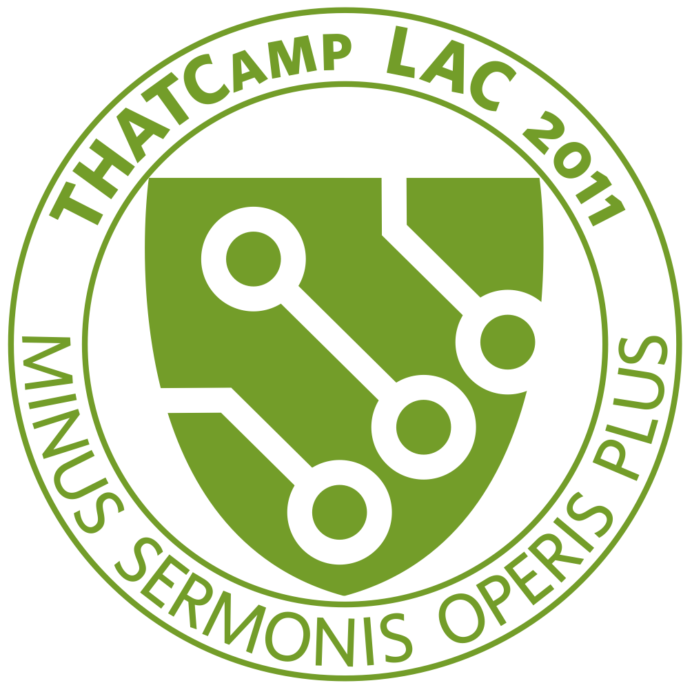
T-shirts and other merchandise (magnets, bags, USB sticks) may need a square logo, such as the marvelous one created by THATCamp Liberal Arts Colleges:
If you create such a logo, make sure that the resolution of your image is high enough (300 dpi at least) to print well on merchandise. Please be sure that “THATCamp” is reproduced using the Whitney font logo files we have provided — you can change the color or size to anything you like, and there are no other limitations.


